ROCIS PurpleAir Plots
PAP 2.0 Quick Start Guide
PurpleAir Plots offers you a way to view PurpleAir (PA) data in various forms, much like the Data Explorer does for the Dylos particle counts.
Purple Air Plots 2.0 retains the core functionality of the original tool while expanding site access and navigation. The original PAP site is still accessible below.
Follow these steps to navigate the dashboard and analyze air quality data. Detailed examples follow the guide.
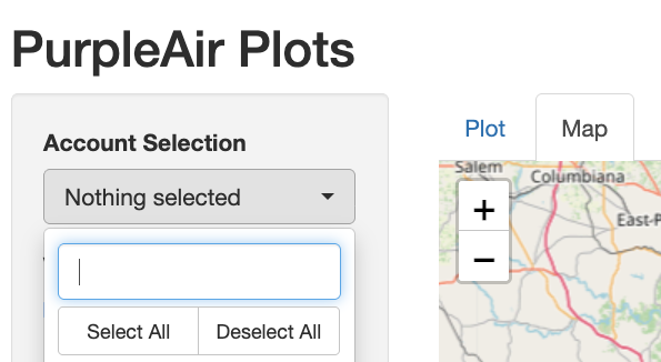
1. Select Your Sites
Use the Account Selection dropdown in the sidebar to choose one or more monitoring locations.
- Search: Type a site code to filter the list quickly.
- Bulk Action: Use the “Select All” or “Deselect All” buttons for rapid changes.
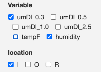
2. Choose Variables and Locations
Identify the specific data points you wish to visualize:
- Variables: Select particle sizes (e.g., umDl_0.3, umDl_2.5), Temperature, or Humidity.
- Locations: Filter by monitor placement: I: Indoor, O: Outdoor, or R: Additional/Remote Indoor
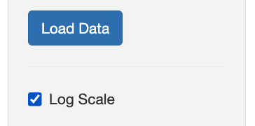
3. Load and Visualize
Click the Load Data button to generate your plots.
- Note: The dashboard does not update automatically when you change selections; you must click “Load Data” to refresh the view.
- Log Scale: Toggle the Log Scale checkbox to better visualize high-magnitude particle spikes.
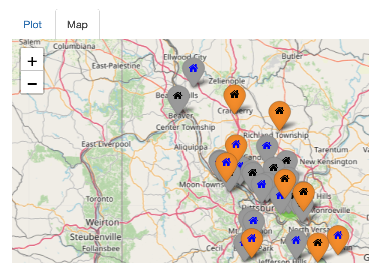
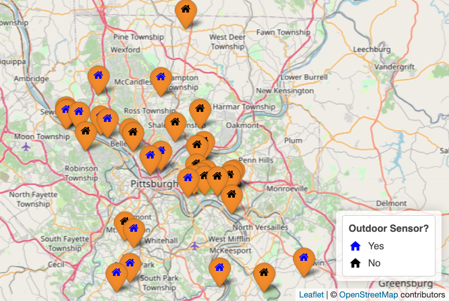
4. Explore the Interactive Map
Switch to the Map tab in the main panel to view site geography.
- Zoom to Selection: Click this button to automatically center the map on your chosen accounts.
- Identify Monitors: Blue house shaped icons indicate sites with outdoor sensors; black icons indicate sites that only have indoor sensors. Orange markers highlight indicate sites you have currently selected.
5. Refine and Compare
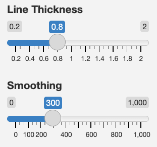
- Smoothing: Adjust the Smoothing slider to reduce “noise” in the data lines for clearer long-term trends.
- Independent Plots: Scroll down to the secondary plot sections to compare different variables or locations for the same site side-by-side.
PurpleAir Plots Examples
Below are examples and instructions to use the PAP.
Example 1: l2y7 indoor particle (0.3 microns) data for the year 2019
Here is a graph of the indoor PA particle (0.3 microns) log data with only 2019 selected:
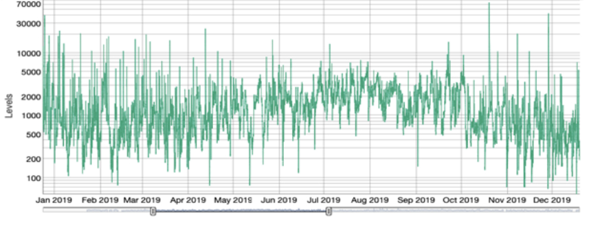
There are many peaks in the course of a year. The observable trends reveal fewer peaks in summer but a higher overall average during those months. Still, at first glance, it really just looks like a bunch of wavy lines.
If we take the same data but average the data to each group of 400 using the smoothing scale, this is the graph that is produced:
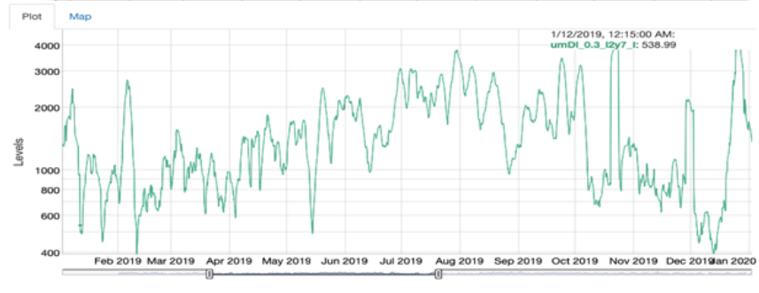
Now the rise in particle counts in summer becomes clearer.
If you change the scale from logarithmic to linear, this appears:
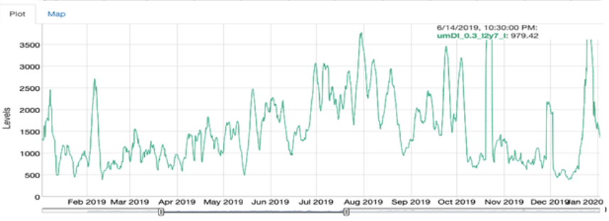
The patterns are similar to the previous graph, but the absolute values can now be read easily on a linear scale on the left. Most of the July/August indoor data falls between 2500 and 3500 particle counts.
Note that if you overdo the smoothing, the data starts to become more obscure. Try it yourself. If the peaks in your graph start to have little plateaus or flat spots on top, you should reduce the amount of smoothing applied.
Example 2: q4y9 indoor particle (0.3 microns) data for part of 2019/2020
This example shows another variation of how to understand the data. In this case, no smoothing was applied to the graph. That was because there appeared to be many indoor particle peaks at some times and very few at others. Smoothing would hide many of those peaks. The graph was also produced using a linear rather than a log scale.
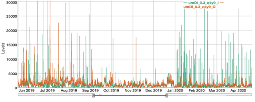
What jumps out from this graph is that the indoor air saw many peaks (probably cooking-related) prior to September 2019 and after January 2020, but not during the interval in between. What happened? In September, the homeowner installed a particle counter that activated the kitchen fan whenever a threshold particle level was reached. The data for the next three months shows that the fan control system resulted in far fewer and lower particle peaks in the house. In early January 2020, the system went offline due to a WiFi problem. The regular kitchen cooking peaks reappeared, as seen by the tall green peaks or spikes in the data on this graph.
Example 3: comparing outdoor particle (0.3 microns) counts for n1g1 and j8p5 in January 2020
If you select “Map” at the top of the highest graph, you will be shown a map of Pittsburgh with the various PA locations both indoor and outdoor. You can select from the map to compare data for a couple of sites to see if outdoor counts in your vicinity are higher or lower than those downtown, for instance. Here are two maps highlighting two sites, n1g1 and j8p5, which are about as far apart as the ROCIS PA monitors can be.
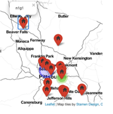
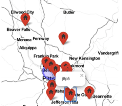
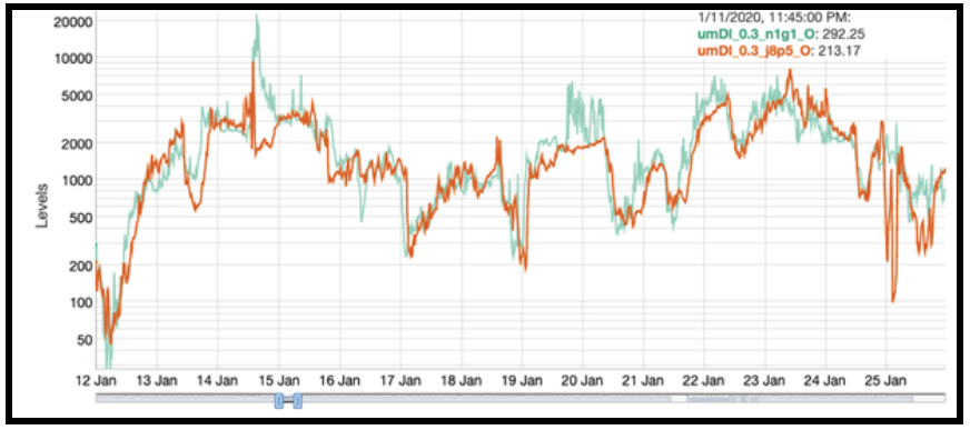
Let’s look at the data for these two sites for a couple of weeks in January 2020 with no smoothing. The data from the two monitors appears to be quite close.
If we smooth the data to 200 and put it on a linear scale, the differences become slightly more apparent:
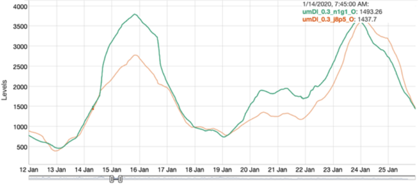
The January 15 peak is higher by about 1000 for the n1g1 location—but the outdoor data for the two sites still follow each other quite closely for monitors that are miles apart.
About PAP 1.0
With this tool, you can:
1. Select the data that you want to look at, zooming in on significant periods.
2. Change the y-axis scale from logarithmic to linear (sometimes easier to understand).
3. Smooth the data through averaging so trends become more apparent.
4. Change the colors, line thicknesses, and other features for graphs to make them easier to read.
5. Locate your monitoring location on a map and compare to other geographical locations.
6. Access nearby proxy data for the outside particle counts if you lack an outdoor monitor or if the one you have fails in some manner.
Each monitor has a unique alphanumeric alternating code, such as a1b2, in the data graph. Only you know the code for your own data. Anyone can locate a PA monitor on either the regular PA site or the ROCIS PurpleAir Plot link. However, the locations of the monitors on the map are not exact to the house or building in which they are located.
The actual monitor location is within a couple of blocks of the marked location. For example, if someone wanted to look at the data in a Clairton location, all that person would know is that there was data recorded in Clairton—they would not be able to relate it to your particular house.
The PurpleAir Plots examples outlined above show how the original graphs can be modified to create more comprehensible information. Most of what we discuss applies to the top graph of the four in the PurpleAir Plot display. The bottom three graphs allow you to separate the data out more discreetly to help make the data easier to understand.
If you want to play with the PurpleAir Plots, you can put the codes used below into the “Account Selection” at the top left, and you will find the same graphs that are excerpted in the screenshots of the examples provided on this page.
Access the original PurpleAir Plots:
PAP Webinar (June 2021):
Makes reference to the original version of PAP
