ROCIS Averager
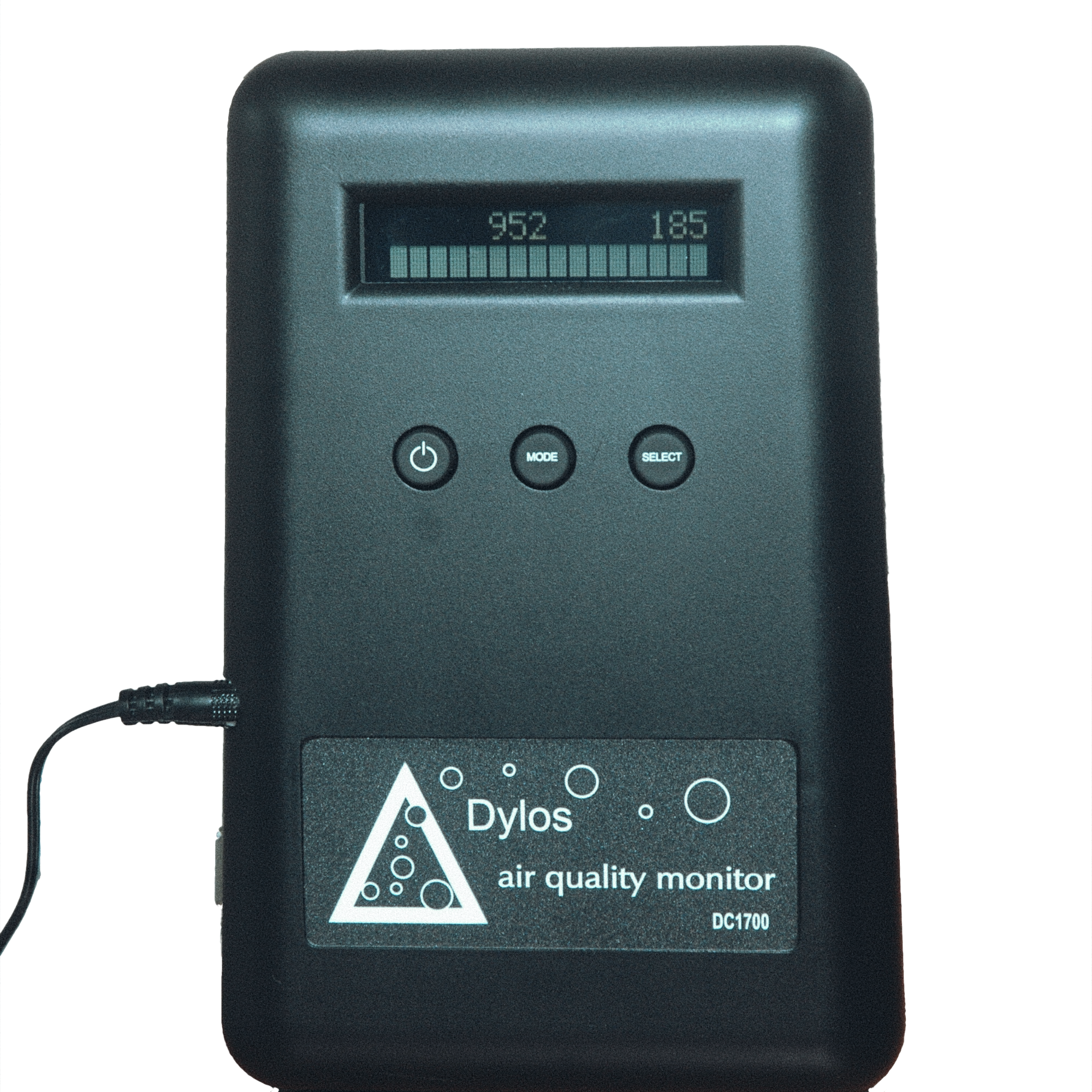
When you first start using a Dylos particle monitor in your home, you might notice dramatic spikes in readings from cooking, flopping down on the couch, or vacuuming.
These incidents are important to pay attention to, of course, but the Dylos data can do a lot more than just report sudden jumps in particle counts.
To help you interpret all of the data gathered by your monitor, ROCIS has developed the Data Averager. Raw Dylos data downloads directly into a macro-enabled Excel spreadsheet and produces fast feedback, showing the differences between indoor and outdoor monitoring locations and producing two time-series graphs of the data.
About the ROCIS Data Averager
Download the Data Averager Spreadsheet (clicking the link will begin the download): Data Averager Spreadsheet
An integral piece of the Low Cost Monitoring Project (LCMP) is the ROCIS Data Averager. The ROCIS Data Averager, Version 6.3, is one of the visualization tools that we use in order to share particle data with LCMP participants. Data uploads from the Dylos monitors report the particle monitor outputs every minute. In one week alone, this can amount to 60,000 individual pieces of data. Such detail can be great for scientific investigations, but it is far too much information for most users. With that many data points, it is difficult to envision what is happening in the house. The ROCIS Averager groups data into 15-minute averages and produces three accompanying graphs. This summary is sent to LCMP participants, but anyone with Dylos outputs can use this tool.
The graphs provide insights into what is happening inside the house (or office) as well as the effect of outdoor particle counts on indoor air quality. Quick rises in the indoor counts (which show up as “peaks” or “spikes” on the line graph) are usually caused by indoor activities like cooking, vacuuming, or kids jumping on the couch. While such peaks can be alarming at first glance, they are usually over fairly quickly. The bar graph on the lower left gives the cumulative times that the monitor spent in each range. If the bar graph is predominantly green—correlating to the Dylos range of “Good” to “Excellent”—then the number of particles in the house are quite low (regardless of a few peaks in the line graph). When the ROCIS data is averaged across time, the houses with the highest particle counts show about 10 times more particles than the houses with the lowest counts.
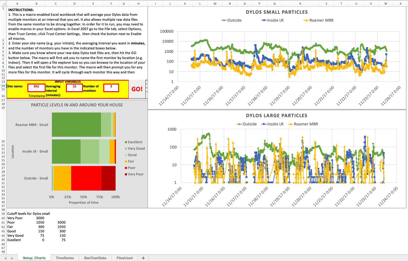
To demonstrate, let’s look at a few examples. These screenshots are not active, as they would be in the spreadsheet, but they will help you know what to expect. The first image below shows a typical first screen, similar to what you will see when you run the Averager.
These three graphs are the first thing you see when you open the spreadsheet. If you want to see tables of data (which can be useful for pinpointing particle generation events), click on the tab on the bottom labeled “TimeSeries.”

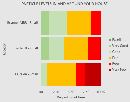
The bar graphs on the lower left-hand side of the “Setup_Charts” tab show the cumulative total particle counts in the monitor locations in your house. They are color-coded to match the Dylos monitor ratings.
The graph on the top right provides a history of monitor output over the recording period (0.5+ µm). The graph on the bottom right shows the same data for the Dylos large counts (2.5+ µm). Usually, sharp spikes in the Dylos large graph correspond to some indoor activity that produces particles, such as cooking.
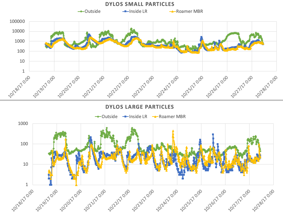
The graphs being examined here are quite typical for a monitor reading. In this case, the bedroom monitor and living room monitors are in the green area of the bar graph (the Dylos “Good” to “Excellent” range) about 30–40% of the time. The particle line graphs show the green outside line as usually higher than the blue and yellow inside lines, except for the times when indoor peaks push house air higher in particle counts. Even when the indoor counts (0.5+ µm) are significantly below outdoor counts, they usually track outdoor counts except for indoor incidents.
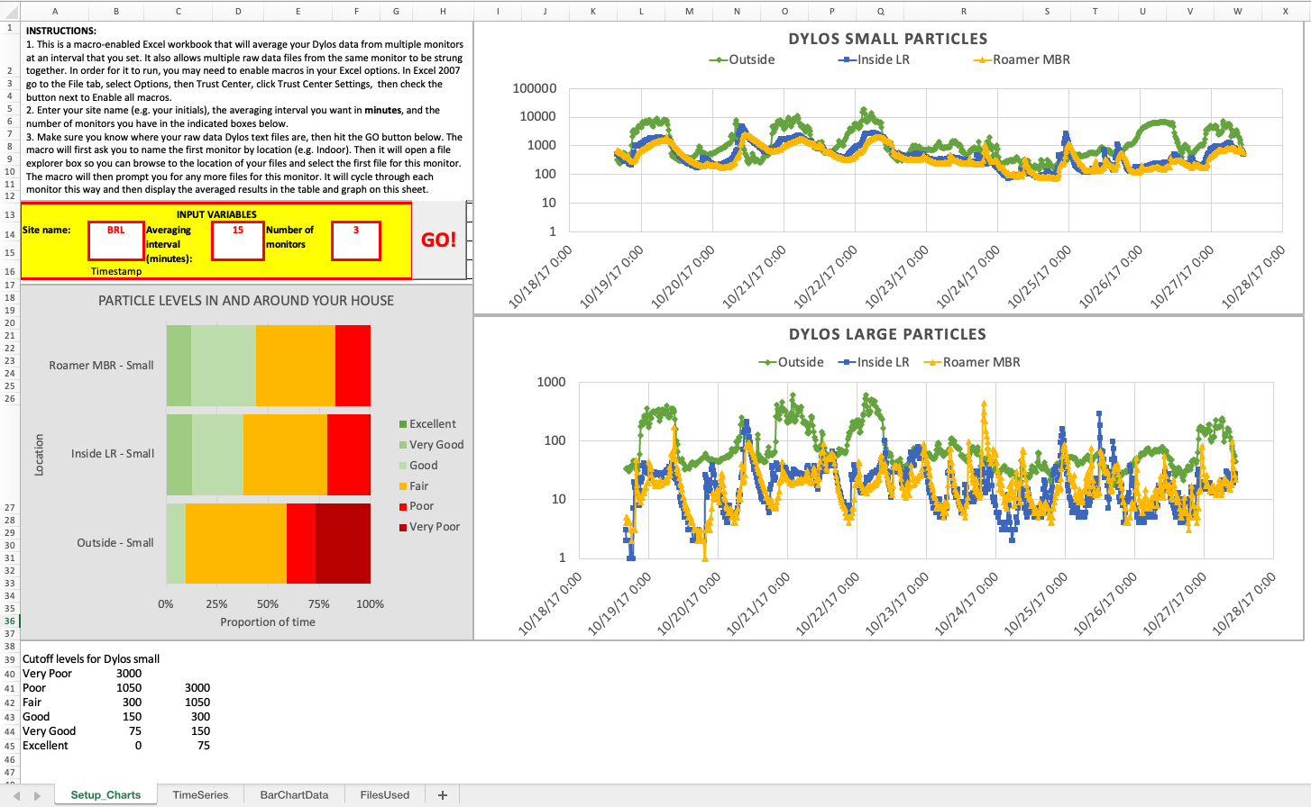
Take a look at two more example graphs below. In these screenshots, you can see that indoor and outdoor counts are very much the same for Dylos small (or total) particles. This usually occurs when windows are open to the outside. The bar graph on the lower left confirms the similarities.
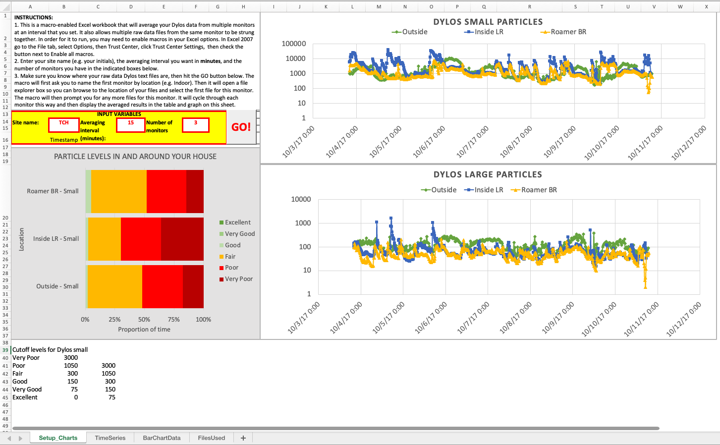
This last graph shows the improved particle counts when a participant runs their furnace fan twenty-four hours a day through a high-efficiency filter. Notice that indoor air particles are far below outdoor particle levels, although they do still follow the general outdoor particle trends in this example.

How to use the ROCIS Data Averager
This discussion references a working Excel file containing the Data Averager. Make sure that your Excel (or similar program) is set to enable macros when you open this file. Note that the Averager macros currently do not run on Mac’s Numbers program, though the spreadsheet results are viewable.
For the working file, the data comes from an anonymous source ABC. However, you can use any Averager file to start the process. You are simply overwriting the data on the previous file.
Hover your cursor over that outlined box showing “ABC” and put in your own three initials.
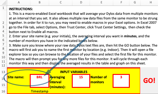
The box to the right indicates the interval you would like the Averager to use. Fifteen minutes is common but you could choose sixty minutes or any other suitable time period. If you have three monitors, the last box on the right is all set. If you have two or four, change it as desired. Then hit “Go!”
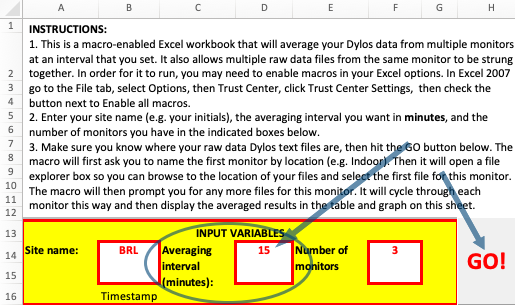
The Averager will ask for the location of your upload files. We usually name the first one “Outside” because almost everyone has an “Outside” file. You need to point the Averager to where it can locate this file.
Once the spreadsheet loads that file, another screen comes up asking if you have files you wish to add to the one loaded—you would do this if, for instance, you had saved two or three different weeks of data. Respond “Yes” or “No” as appropriate. Once all the data is loaded for “Outside,” you will go through the same process for the other sites where you have monitors.
Once you have loaded the 2–5 files that you specified you had, the Averager will churn away. Before it produces the graphs, it often (but not always) gives you a couple of warnings. Just acknowledge them by clicking “OK.” The spreadsheet then creates the file with the three graphs and the tables for reference.
