Mapping & Tracking
Air Quality Mapping & Tracking Tools
Outdoor pollution can vary greatly from one day to the next.
Before you head outside, you may want to know what the outdoor air quality is like where you are.
There are a number of powerful tools that map and track air quality in real time.
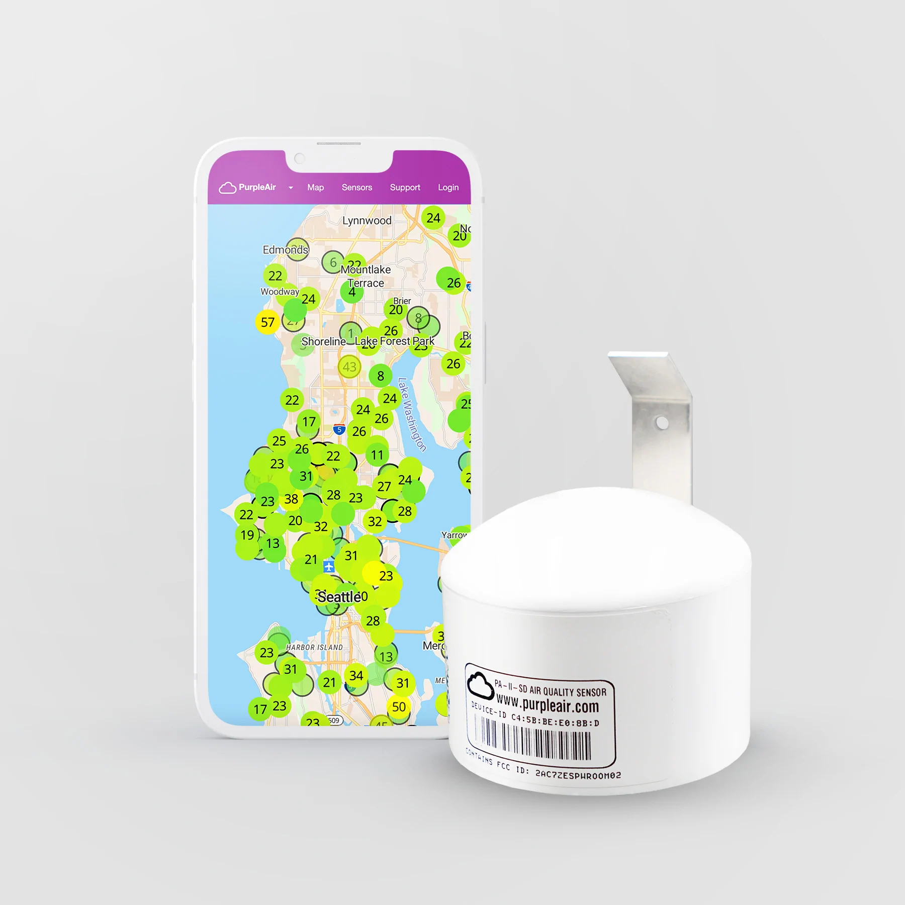
PurpleAir
PurpleAir maintains a real-time air quality map using data from PurpleAir monitors around the world. Monitors are owned and maintained by individual users, but the map provides a live picture of particle pollution that is greater than the sum of its parts. PurpleAirs report both indoor and outdoor data. The map is interactive, offering several different controls to see a nuanced picture of air quality. For more information, watch this ROCIS video on PurpleAir monitors.
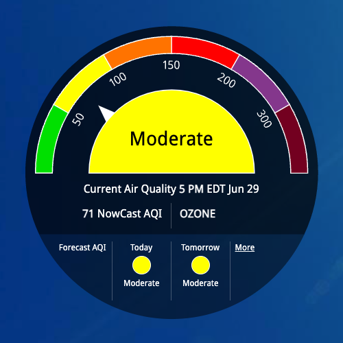
AirNow
This EPA website allows you to check the air quality where you are based on EPA monitor data reporting PM 2.5, PM 10, and ozone. Just type in your zip code, and you will see a gauge of your air quality and a map of your region. AirNow offers both current and projected air quality. Maps can be animated to see trends. For more information, watch this ROCIS video on the AirNow site presented by team member Linda Wigington.
SmellPGH
The SmellPGH app, developed by the CMU CREATE Lab, allows users in Southwestern PA to report on the quality of their air, from good to bad. When these reports are mapped and animated, they can provide a clear picture of the air quality in and around Pittsburgh on any given day—all through the power of crowdsourcing. See the air complaints coming in right now or look back at the day of your choice. SmellPGH reports are mapped alongside wind direction and particle monitors maintained by the county. For more information, watch this ROCIS video on Smell PGH presented by team member Jessie Kester.
The Breathe Cam
These high-resolution cameras provide 24/7 live feeds of Pittsburgh’s skyline, the Mon Valley, and the Ohio River Valley. Users can compare good and poor quality air days, download footage of a specific pollution or weather event, and take a look at different sites in the region as they appear right now. The Breathe Cams are maintained thanks to the Breathe Collaborative, a coalition for clean air in the Pittsburgh region.
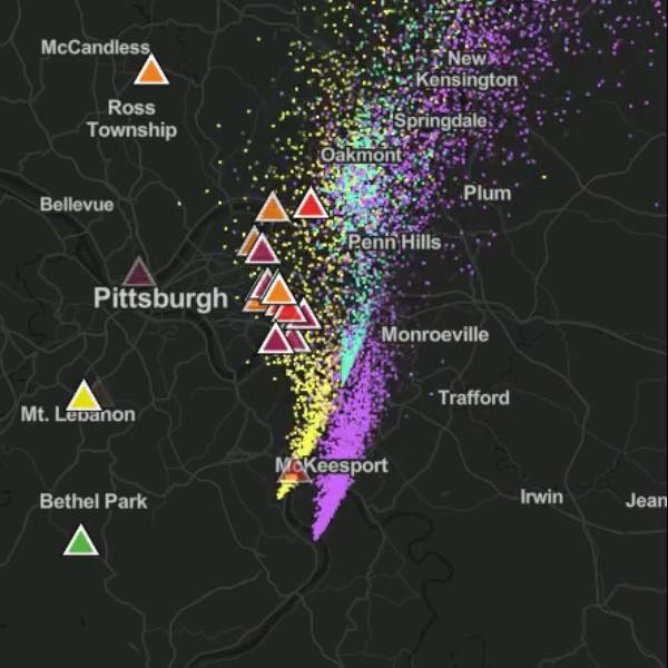
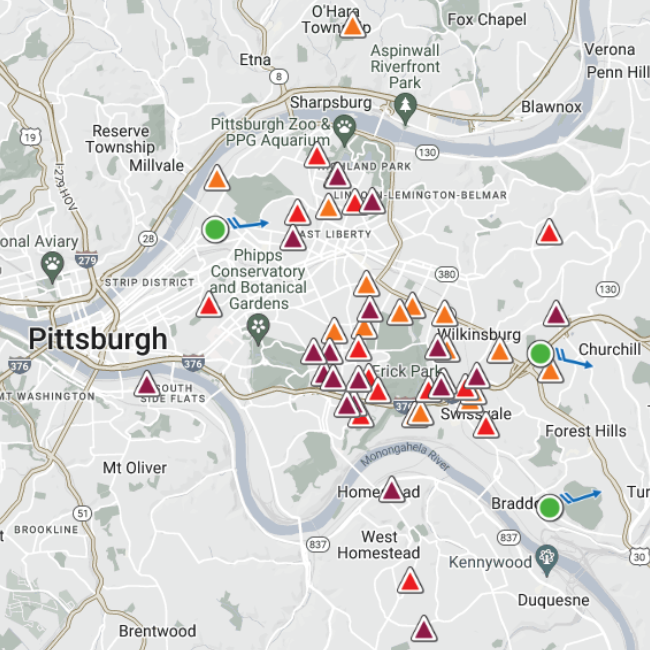
PlumePGH
CREATE Lab has developed PlumePGH to integrate crowdsourced data from SmellPGH with NOAA weather models and air quality monitoring data from regulatory and citizen-owned networks. The alignment of these independent data sources can help us understand whose health may be impacted by this industrial pollution. These animated maps can be viewed in real-time or for any date in the past few years. For more information, watch this ROCIS video on Plume PGH presented by team member Sam Totoni.
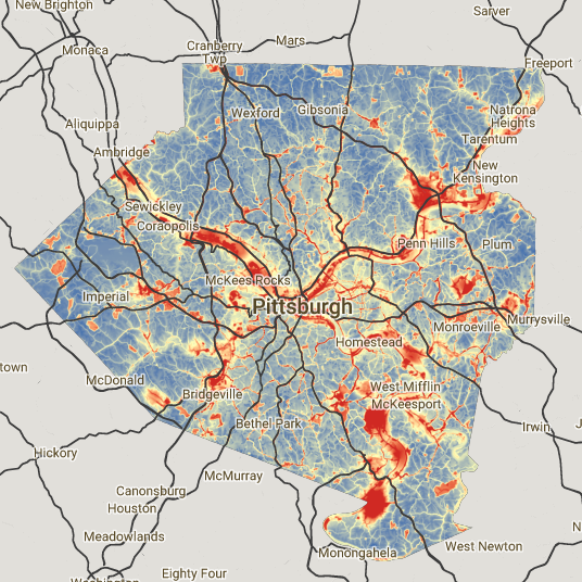
CREATE Lab VOC Map
Particle counts tell only part of the story of air pollution. CMU’s CREATE Lab offers a mapping tool for the data produced by their network of VOC monitors. Look at real-time or historical data to identify local and regional VOC trends.
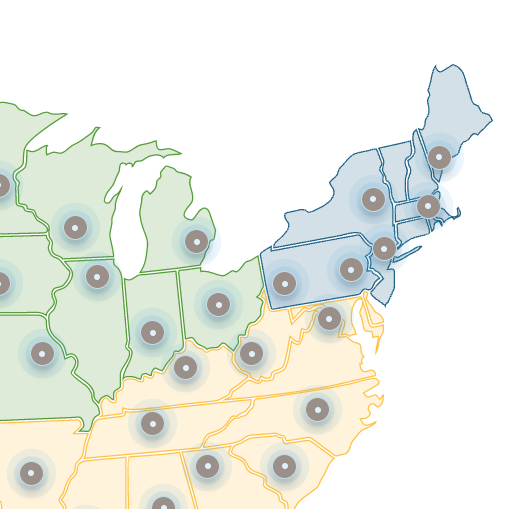
Breathe Meter
The Breathe Project’s Breathe Meter allows you to compare cities in different regions of the United States in terms of air quality. Click on a city to see its percentile rank for average annual particle pollution out of 328 urban areas using U.S. EPA data from 2019–2021. Compare by region or see the worst air quality locations in the nation.
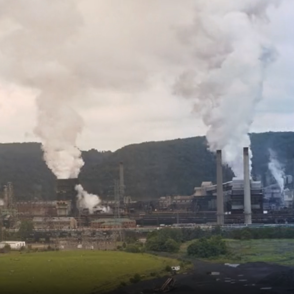
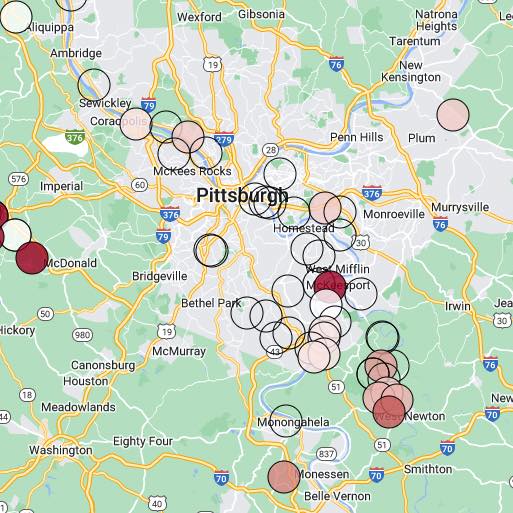
Pollution Map
The Breathe Project’s pollution map shows the concentration of black carbon (soot produced by industrial facilities and diesel trucks) and nitrogen dioxide (commonly found in vehicle exhaust and industrial emissions) in Allegheny County. Zoom in to a particular neighborhood to see detail.