ROCIS Data Explorer - Participant Example 6
This link will take you to the Data Explorer site: https://bluetree.shinyapps.io/lcmpexplorer2/
In the case below, we are discussing Example 4, which can also be accessed by entering the participant code j1t8.
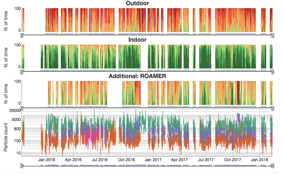
This set of data for Example 6 is quite unusual. The participant has been recording continuously for two years so there is an incredibly comprehensive set of data on the particle levels in this house. Additionally, they have been using portable air cleaners continuously so their interior particle counts are lower than many others. Here is the breadth of the data:

What can we see here? In two years of outdoor monitoring, the daily outdoor averages are usually in the Dylos “Fair” to “Very Poor” range. It is hard to discern a seasonal trend, especially in only two years, but there may be more of the “Very Poor” (red) outdoor conditions showing up in the December/January period.
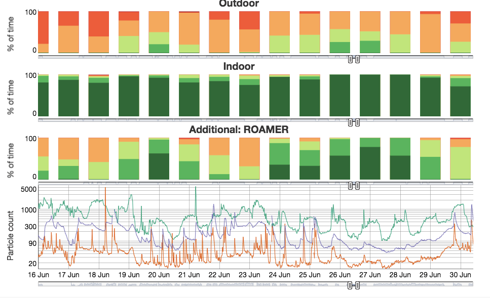
Here is an example of the best indoor air the participant created with their portable air cleaners. Those days with almost all dark green bar graphs show that the indoor particles are < 75 counts. This is in summer. Participants with their windows open during this period see indoor counts 10X to 100X as high.

Here is another interesting period. The house was unoccupied, but the homeowner had left the air cleaner on a timer so it cycled off and on. These cycles clearly caused particle changes measured by that monitor.

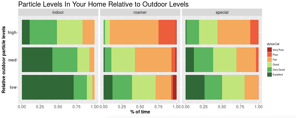
The three graphs at the bottom of each example show the influence of outdoor air levels on indoor particle counts. The top bar is for the 25% of the time that the outdoor air is highest in particles. The lowest bar shows the same results for the cleanest 25% of outdoor air. You can see that, even with air cleaners modifying the indoor environment, the outdoor particle counts still influence the indoor concentrations.

Return to the ROCIS Data Explorer page.
