ROCIS Data
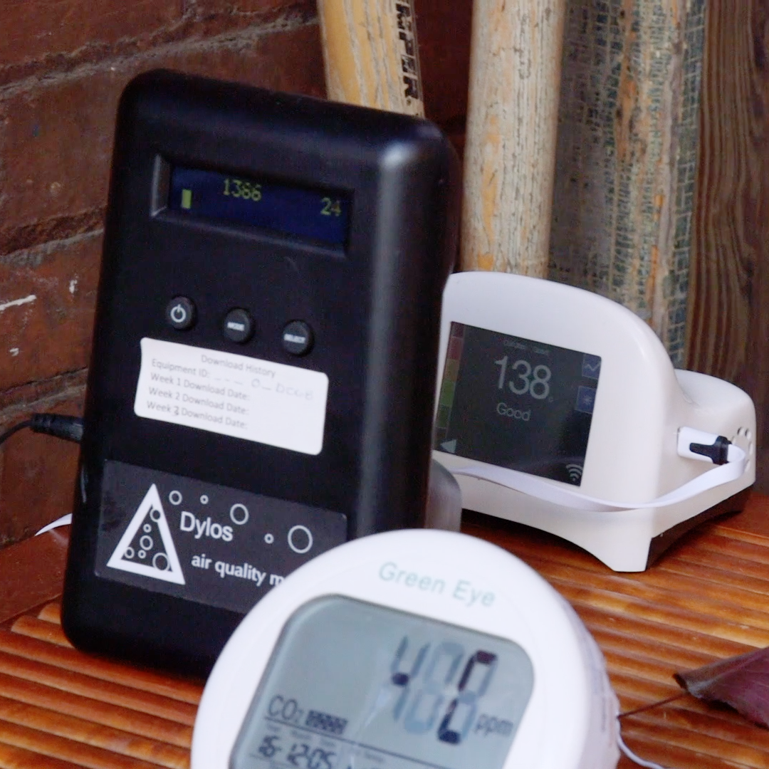
When using low-cost particle monitors for the first time, participants in the Low Cost Monitoring Project (LCMP) are often surprised when incidents like burning toast or even just cooking an egg cause spikes in the readings. While it’s important to recognize and reduce the frequency of these spikes, they don’t tell the whole story of indoor air quality.
Once you know how to make sense of it, the data tells a much more nuanced story. Short, dramatic spikes, it turns out, do not appear to contribute significantly to the big picture of air quality in a house. The difference in indoor particle counts between any two LCMP participant sites can be remarkable—sometimes as much as a twenty-fold increase from one site to the next. That’s about a lot more than just a few mishaps on the stove, even though they send the numbers soaring.
It can be hard to know how to interpret the monitors’ output. How do outdoor particle counts influence indoor counts? How much does it help to use a kitchen exhaust fan or to use a portable air cleaner? In one week alone, the three Dylos particle monitors that we use in the LCMP generate 60,000 data points for each site! To help LCMP participants manage all this data, the ROCIS team has developed several useful tools outlined below.
For an overview of our initial data analysis and visualization efforts, see the ROCIS presentation for the US EPA’s 2017 Smart Cities Air Challenge webinar series, “Data Use in Community Air Quality Projects.”

What did we learn from having carbon dioxide monitors in over 400 Pittsburgh homes?
To view additional ROCIS presentations, visit our ROCIS Presentations Page.
ROCIS Data Tools

ROCIS Data Averager
An integral part of the LCMP, this visualization tool puts the particle data gathered through monitoring into a form that participants can view and understand. An Excel spreadsheet processes the data quickly and clearly so that participants get feedback after each weekly download.

ROCIS Data Explorer
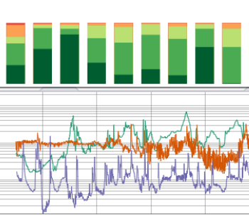
The ROCIS Data Explorer produces two different kinds of graphs to help visualize particle monitoring data:
- A stacked bar chart showing the percentage of time that a monitor recorded particle counts in a range from “very poor” to “excellent.”
- A color-coded time series line graph showing the scale of particle count over time.
Users can change the timeframe of the data, select which monitors are being displayed, adjust data smoothing settings, and change the scale of particle count on this visualization tool.

PurpleAir Plots
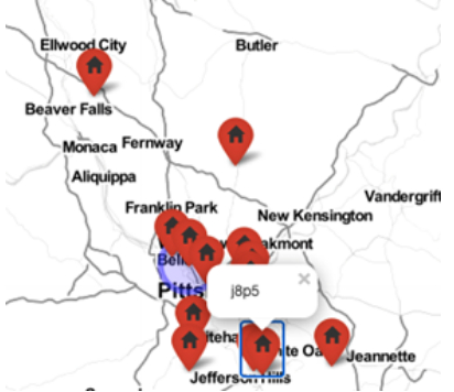
Similar to the ROCIS Data Explorer, the ROCIS PAP allows you to select specific data, zoom in on a particular time period, smoothe the data through averaging, and change line color or thickness to make the graphs easier to read. Using the map feature of the PurpleAir Plots, you can also view other ROCIS PurpleAir monitors to compare readings.
