ROCIS Data Explorer - Participant Example 7
This link will take you to the Data Explorer site: https://bluetree.shinyapps.io/lcmpexplorer2/
In the case below, we are discussing Example 7, which can also be accessed by entering the participant code w2i9.
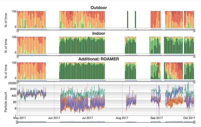
Let’s use the Data Explorer to see what happens when you install good furnace filtration. First, here is the entire several-month history of one participant’s Dylos small particle counts. Monitor readings are shown in stacked bar graphs. This is the first screen you see when you load the Data Explorer with your Account Code. This participant was monitored from May to October 2017.
The top graph, showing outdoor particles, varies from month to month but is generally in the Dylos “Fair” to “Poor” rating. The interesting part of this set of graphs is in the second and third rows.
There is a big change in the house performance between May and mid-summer. The inside particle counts go from “Fair” and “Poor” all the way to “Excellent”.

Here are highlighted results from this house in Spring 2017. These are excerpted from the line graph, which is the lowest Dygraph above. The outside air quality is pretty good. The indoor particle counts closely follow outdoor levels (turquoise) so it is very likely that the windows are wide open. This example uses the log scale of the graph.

Here is the same example with the log scale box unchecked. In this case, the linear scale does not provide any advantage to the log scale graph. The peak on May 23 makes the y-axis go to 6000 counts, but most of the time the indoor and outdoor particles are in the range of 0 – 2000 counts.

The participant had his furnace fan and ductwork reworked to permit a larger and more efficient MERV 13 filter. An ECM motor allowed for economical continuous fan operation. Here are some midsummer results with the windows closed and fan on continuously, presented on the log scale. You can see how the two inside monitors are now far lower than the outside particle count.

Let’s look at that graph using the linear scale instead of the log scale. Now you can see that the inside counts are near zero as the outdoor counts range from several hundred to several thousand. A couple of outdoor peaks above 5000 make the vertical scale quite large.

However, if you really want to see what is happening with the inside counts on a linear scale, the Dygraph can be modified only to show the lower counts. Instead of highlighting the graph left to right (to select dates), highlight it from bottom to top, but stop when you hit 1500 counts. This new graph cuts off the higher peaks but provides a more understandable display of the very low inside particle counts. Both inside monitors are usually near zero but with daily spikes generally to several hundred counts due to activity. The inside counts rarely exceed 500.

Return to the ROCIS Data Explorer page.
